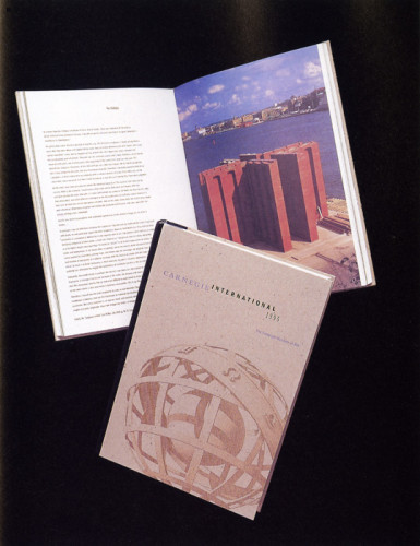
Carnegie International 1995
plus design inc., Boston, Massachusetts, 1995
Description
This project is part of the identity system we designed for the 100th anniversary of the Carnegie International exhibition at The Carnegie Museum of Art in Pittsburgh.
The catalogue concept celebrates the centennial of the Carnegie International by referencing the past, present and future. In developing the design, the typographical grid served as a guide representing a historical time line. The Steely blue, copper and black colors were selected for its ability to lay flat the catalogue in order to capture the experience of viewing the exhibition. The catalogue cover reflects the challenge of successfully producing a duotone foil stamped image.
Collections:
Communication Graphics: 17 (1996)
Repository:
Denver Art Museum
Discipline:
Brand and identity systems design
Format:
Brand identity, Booklet
Credits
- Design firm
- plus design inc.
- Art director
- Anita Meyer
- Designers
- Anita Meyer, Dina Zaccagnini
- Photographer
- Various
- Editor
- Phil Freshman
- Typographer
- Moveable Type Inc.
- Printer
- W.E. Andrews Company
- Binder
- Acme Bookbinding
- Publisher/client
- The Carnegie Museum of Art
Loading...
Loading...