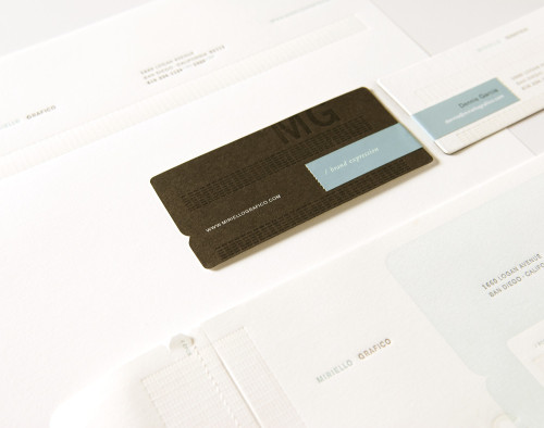
Miriello Grafico, Stationery system
Miriello Grafico, 2007
Description
Miriello Grafico needed a new identity system to coincide with a move into a new, modern studio space. It was important that the identity not only reflect the space but also refresh the firm’s previous identity, which had been used for over 15 years. The move provided the studio the perfect opportunity to reevaluate where they are and how they wanted to present themselves moving forward. The overall presentation of the identity is modern, clean and minimal. Unique printing techniques and finishes were used to intrigue and entice the recipient. A subdued color palette of high-contrast tones are accented with a warm blue that is used sparingly throughout. The design uses a tint-varnished grid pattern that aids the viewer and directs their eye as they scan each piece. In the case of the business card, it creates an alignment marker for the wraparound labels.
Credits
- Design firm
- Miriello Grafico
- Creative director
- Dennis Garcia
- Designer
- Dennis Garcia
- Printers
- Neyenesch, Defrance
- Printing methods
- Litho, letterpress, engraved
- Papers
- Mohawk, cool white, vellum
- Typefaces
- Akzidenz-Grotesk, Bembo
- Client
- Miriello Grafico

