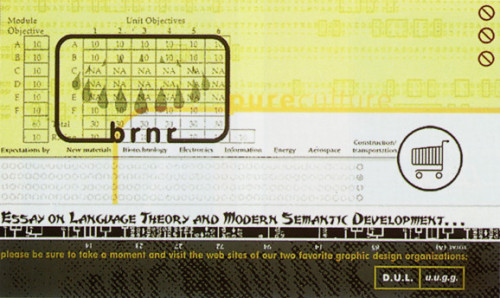
BRNR Website
BRNR Graphics, Redondo Beach, California, 1996
Description
BRNR is a collection of graphic experiments, which initially arose from a questioning of standardized “default” design and navigation solutions on the Web. BRNR is largely a design-driven site, and the high percentage of designers in the site’s audience certainly reflects that.
One objective in developing the site was to invite the user to navigate creatively without too much guidance and explanation. This seems to result in a more satisfying interaction, as it allows for unique user experiences, well suited to the nonlinear landscape of the Internet (and to a non-info-heavy site like BRNR). There is an art, however, to keeping a site interesting and open without making it completely ambiguous, amorphous, and unstructured—at which point it might no longer really be considered graphic design, but just a linked series of artsy screens, not solving any organizational problems. BRNR attempts to strike a balance between design and art, structure and ambiguity, logic and freeform associations.
Credits
- Design firm
- BRNR Graphics
- Art director
- Michael French
- Graphic designer
- Michael French
- Illustrator
- Michael French
- Photographer
- Michael French
- Programmer
- Michael French
- Client
- BRNR Graphics


