BEople magazine
Base, New York, New York, 2001
Description
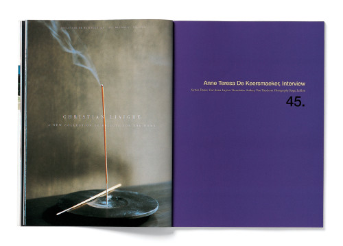
BEople was launched in one of the most difficult magazine markets of the last two decades. We therefore made design decisions to attempt to have it attract attention in a crowded newsstand: first, the dot on the cover, a simple idea to place emphasis on the magazine’s title; second, an indeterminate grid that shifts according to the subject matter. But perhaps most importantly, we strove for an overall aesthetic that blends classicism and modernism, allowing the magazine to appear rich but uncluttered and to evolve with every new issue.
Juror Notes
“We love that they stuck the masthead over the face of a person, and that it’s a magazine called Belgian People.”
“I like the pacing and the use of white space.”
Collections:
AIGA 365: 23 (2002)
Repository:
Denver Art Museum
Discipline:
Editorial design
Format:
Magazine
Credits
- Design firm
- Base
- Creative direction
- Base
- Design
- Base
- Photographer
- Jan Welters
- Editor
- Hilde Bouchez
- Typefaces
- 65 Helvetica Medium, Sabon
- Client
- <em>BEople</em> magazine
Loading...
Loading...


