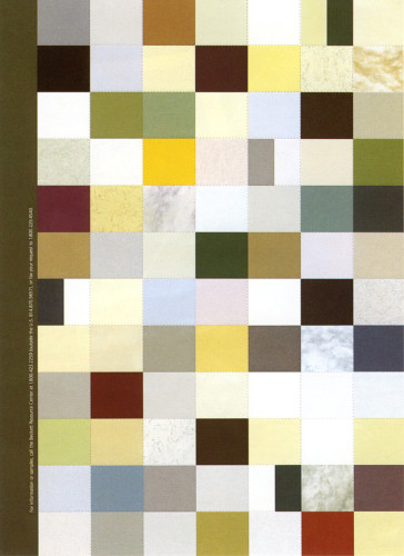
Beckett Advertisement
Petrick Design, Chicago, Illinois, 1998
Description
The audience was designers, printers, and paper merchants. The objective was to raise awareness of the Beckett name, the new logo and new tagline. We were asked to use actual Beckett paper and create the ad as an insert.
Our solution was inspired by the new tagline: Beckett. Spec It. It is a patchwork quilt of all the colors in the Beckett line, perforated into small sections to achieve the effect of a sheet of spec chips. The paper colors are four-color simulations of actual paper stock colors.
The ad is unique in that is has no headline, no body copy, and no photo or illustration. Yet the backside has 84 logos and taglines. Production challenges included creating the ad in various trim sizes and approximating 84 color with four-color process within one page.
Credits
- Design firm
- Petrick Design
- Art director
- Robert Petrick
- Designers
- Robert Petrick, Dave Wozniak
- Typefaces
- Frutiger, Perpetua
- Printer
- Lithographix, Inc.
- Paper
- Beckett Super Smooth Expression Iceberg 65# Cover
- Client
- Beckett Papers