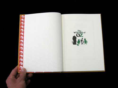
The Wizard of Oz
Stripe, San Francisco, California, 2008
Description
The Wizard of Oz takes L. Frank Baum’s The Wonderful Wizard of Oz as an entry point to examine the relationships between this classic novel and art. Many have interpreted the story as a metaphor for the political, economic and social events of 1890s America. Artists featured in this exhibition presented work that connected with these themes.
How could we use the novel as a starting point, yet create a fresh visual language for a “contemporary” exhibition? One of our ideas was to allow the catalogue to remain a little ambiguous. We wanted someone to pick it up and not be sure if they were looking at the original novel or something else. One constraint we set was that the catalogue needed to be the same size as the original first edition. The rest of the design used classical references from the original book in combination with more contemporary design choices to create a publication that referenced the past, but connected to the themes of an art exhibition in 2008.
Juror Notes
A charming design; playful use of type and color selection; has a storybook quality.
Nice surprises like the ribbon and the back-cover illustration of Dorothy, the lion and the tin man.
The paper changes and small scale make this a perfect exhibition catalogue and gift book.
Credits
- Design firm
- Stripe
- Creative director
- Jon Sueda
- Art director
- Jon Sueda
- Designers
- Jennifer Rider, Jon Sueda
- Production director
- Erin Lampe
- Authors
- Claire Fitzsimmons, Jens Hoffmann, Rebecca Loncraine, Natalie Musteata
- Editor
- Lindsey Westbrook
- Curator
- Jens Hoffmann
- Publisher
- California College of the Arts/Wattis Institute of Contemporary Arts
- Trim size
- 6.75 x 9.25
- Pages
- 76
- Printer
- Westcan Printing Group
- Typefaces
- Berkeley, Windsor
- Quantity printed
- 1,500
- Client
- CCA Wattis Institute of Contemporary Arts
- Production coordinator
- Meghan Ryan


