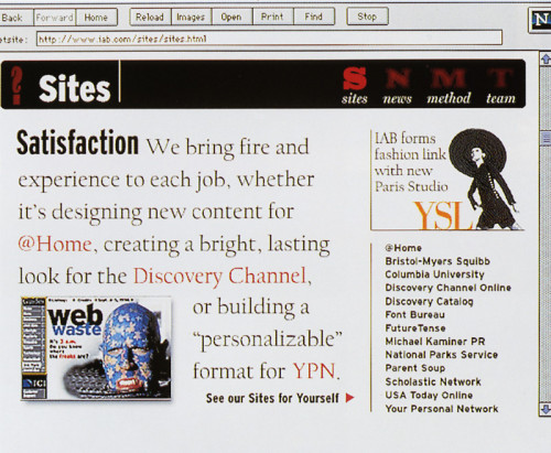
Interactive Bureau Website
Interactive Bureau, New York, New York, 1996
Description
The goal was to make design look fun and easy and to promote content-rich web design. Through clear, sharp graphics and text, we introduce potential clients to our experience, style, and team as well as our working method. Though much of the site uses graphics, palettes are optimized for quick download, and window size is kept small for minimal scrolling. Large text is favored over large images. What we’re trying to push is the “old-fashioned” idea that the message is the important thing and design is the messenger.
Collections:
Design of Understanding 2
Repository:
Denver Art Museum
Discipline:
Information design
Credits
- Design firm
- Interactive Bureau
- Creative directors
- Roger Black, John Schmitz
- Interface designers
- Theo Fels, John Miller, Tom Morgan
- Copywriter
- John Miller
- Typefaces
- Giza, Interstate, Californian
- Programmer
- Frank Desiderio
- Client
- Interactive Bureau
Loading...
Loading...