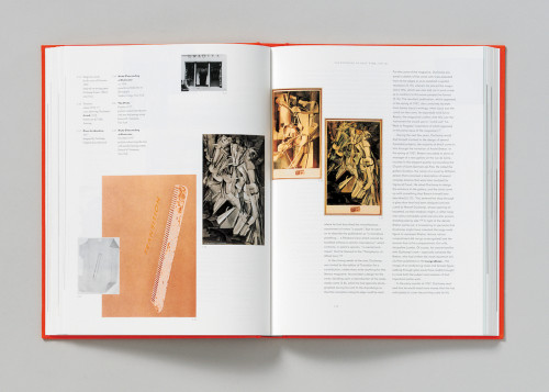
Marcel Duchamp: The Art of Making Art in the Age of Mechanical Reproduction
studio blue, Chicago, Illinois, 2000
Description
This catalogue is about Marcel Duchamp and his work in multiples—including a good deal of graphic design that very few people have seen before. Duchamp was a type aficionado and loved using a broad range of typefaces in a given work, sometimes varying each letter by font, or sometimes each page. He despised repetition; each work looks completely different from the next, making this difficult subject matter to represent visually. Because the idea of optics, transparency and the ability to look at something forwards and backwards were important to Duchamp, we appropriated the titling type from a Russian eye chart he owned, and repeated it in reverse on the back cover. The chapter openers repeat this theme. The book’s structure responds to Duchamp’s work by juxtaposing a rigid typographic grid with images that float freely and overlap.
Credits
- Design firm
- studio blue
- Art directors
- Kathy Fredrickson, Cheryl Towler Weese
- Designers
- Cheryl Towler Weese, Heather Corcoran, Garrett Niksch
- Illustrator
- studio blue
- Production coordinator
- Matt Simpson
- Trim size
- 11 3/4 x 9 inches
- Pages
- 332
- Typefaces
- Handmade type from a Cyrillic eye chart owned by Duchamp, Metro, Agency, Ariston, Kaufmann, Becka Script, Clarendon, Cooper Black, Nobel, Memphis, Bodoni 72, Truesdell
- Paper
- Mewdon uncoated cover
- Binding
- Smythe-sewn
- Author
- Francis Naumann
- Publishers
- Ludion (Belgium), Harry N. Abrams, Inc.


