

Packaging, essn
Brand Engine [formerly Be Design], Sausalito, California, 2004
Description
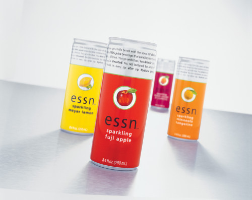
With the proliferation of alternative sodas on the market, SkylarHaley needed an extraordinary branding and packaging approach to stand their new product apart. Brand Engine provided a name—essn, the essence of unique varietal fruits—and a look that would reflect its mature, refined taste while holding the attention of younger, faster-paced consumers. The main challenge was to communicate the purity of a 100 percent–juice sparkling beverage in a can typically used for energy drinks. Simple bold graphics and vibrant colors on a sleek bullet can provide stopping power and badge brand appeal. The minimalist design scheme contrasts with the detailed fruit illustrations, which reflect the product’s high-quality ingredients. Already stopping traffic at retail, essn is gathering a cult following at dance clubs, bars and restaurants, and appeared in a recent New York Times article on popular alternative beverages.
Credits
- Design firm
- Brand Engine [formerly Be Design]
- Art director/creative director
- Eric Read
- Designers
- Yusuke Asaka, Josh Levine, Eric Read
- Illustrator
- Martin Ledyard
- Photographer
- Brent Lindstrom
- Copywriter
- Georgia Thunes
- Project manager
- Kirk Gelardi
- Printer
- Ball
- Printing method
- flexography
- Client
- SkylarHaley