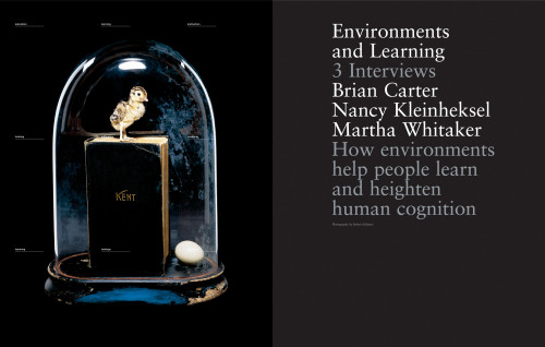
SEE: The Potential of Place, Spring 2005
Herman Miller, Inc., Zeeland, Michigan, 2005
Description
Herman Miller created SEE to provide a forum for discussing broadly the built environment, for research into its effects of creativity and human performance, and to serve as a platform to connect its customers and community—especially the architecture and design community. The SEE team was charged to raise the levels of both graphic design and intellectual content from that of the usual industry publications. Drawing on talent from around the world, the SEE team commissions articles and photography designed to appeal to people who believe the built environment can heighten human performance and creativity.
Juror Notes
Pacing: empty space building to very full spreads and starting again.
Feels very modern in both the pacing and treatment.
Very luxurious.
Very Herman Miller.
Credits
- Design firm
- Herman Miller, Inc.
- Creative directors
- Bill Cahan, Steve Frykholm, Herman Miller, Cahan & Associates
- Art directors
- Todd Richards, Cahan & Associates
- Designers
- Nicholas Davidson, Todd Richards, Cahan & Associates
- Illustrators
- Brian Cairns, Joseph Hart, Blair Thornley
- Photographers
- Henning Bock, Todd Hido, Ingvar Kenne, Robert Schlatter, Tim Simmons, Michael S. Yamashita/Corbis
- Production directors
- Marlene Capotosto, Herman Miller
- Production artists
- Clare Rhinelander, Cahan & Associates
- Editors
- Clark Malcolm, Herman Miller
- Writers
- Pamela Erbe, Ann Genther, Dick Holm, Carol Lecocq, Julie Ridl, Dan Sorensen
- Project managers
- Herman Miller, Gay Strobel
- Printer/binder
- Hennegan Company
- Printing method
- Offset
- Paper
- Mohawk, Via Bright White Smooth, 80 lb. cover and 70 lb. text
- Typefaces
- Helvetic Neue, Helvetic Rounded, Sabon
- Client
- Herman Miller, Inc.


