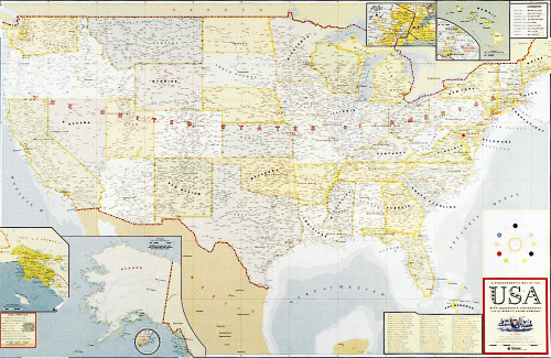
Benefit Map of America
Drenttel Doyle Partners, New York, New York, 1996
Description
Today, the United States of America, tomorrow, the world! This promotion for Benefit paper recolors the entire country, paying homage to late-nineteenth-century cartography with late-twentieth-century tools. The underlying theme of Benefit is that the colors go with the colors, and what better way to show the chromatic harmony than to take on the nation itself! In addition to all the states and capitals and major cities, we’ve included the birthplaces of our clients and staff. We’ve also included need-to-know information like state birds and nicknames. The fonts have all been redrawn to approximate hand-lettered maps from the early part of the century. And who knew that the national flower is the rose?
Collections:
Communication Graphics: 18 (1997)
Repository:
Denver Art Museum
Discipline:
Information design
Format:
Illustration, Information graphic
Credits
- Design firm
- Drenttel Doyle Partners
- Creative director
- Stephen Doyle
- Graphic designers
- Cary Murnion, Dan Drenger
- Printer
- Red Ink Productions
- Paper
- Champion Benefit 70# White Text
- Typeface
- Custom
- Client
- Champion International Corporation
Loading...
Loading...