Techno•Seduction
The Cooper Union Center for Design and Typography, New York, New York, 1996
Description
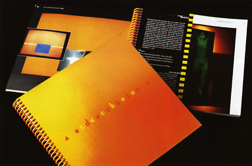
Techno•Seduction is a comprehensive catalogue designed to complement and document a major exhibition of the same name held at the Cooper Union in early 1997. The format of the book reflects the need to represent a diverse group of forty installation artists brought together because of their shared interest in technology. The book was designed to give each artist one and a half pages. (The leaves actually alternatve between 8.5” square and 4.25” x 8.5” half pages.) The purpose of this unusual format was twofold: limiting the book to a manageable scale and, more important, controlling the flow from artist to artist in a way that emulates the kind of visual sequencing one experiences when exploring new media. The catalogue also defined the graphic style for the exhibition in its use of color, fonts, and the logo, which became integral to the identity of the project.
Credits
- Design firm
- The Cooper Union Center for Design and Typography
- Graphic designer
- Mindy Lang
- Typographer
- Mike Essl (Cover)
- Typefaces
- Emigre Suburban, Adobe Garamond
- Printer
- Rise Graphics
- Paper
- Mohawk 50/10 Plus
- Publisher/client
- The Cooper Union School of Art