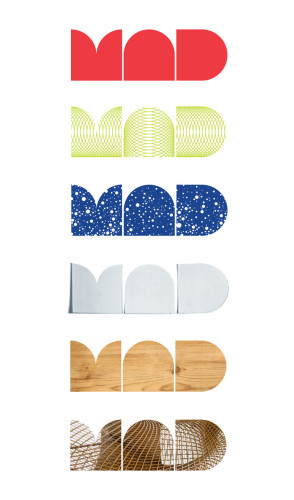
Museum of Arts and Design (MAD) Identity
Pentagram, New York, New York, 2008
Description
Pentagram created a new identity for the Museum of Arts and Design to coincide with the opening of its new home at the refurbished 2 Columbus Circle in New York. The geometric-based mark reflects the circles and squares present in the building’s shape, its location on Columbus Circle—the only circle in Manhattan’s street grid—and the building’s iconic “lollipop” columns retained in the redesign.
The MAD acronym is a great asset; it’s short, memorable and pronounceable, but, in some ways, overly familiar. Part of our design problem was to make it surprising, less familiar and proprietary—to come up with a MAD that could only be the Museum. We also wanted a way of writing the name that embodied the values of the Museum and that could appear in different ways on different occasions. The Museum, after all, is dedicated to artists who take typical forms—say, vessels or chairs—and transform them over and over again. The simple form of the new logo permits just that kind of transformation.
Juror Notes
Really unusual combination of letters that work very well in all implementations. The logo comes alive with the application.
Credits
- Design firm
- Pentagram
- Art director
- Michael Bierut
- Designers
- Michael Bierut, Joe Marianek
- Typefaces
- Arnhem, Futura, MADface
- Client
- Museum of Arts and Design (MAD)


