José Antonio Hernández-Diez
Pure+Applied, New York, New York, 2003
Description
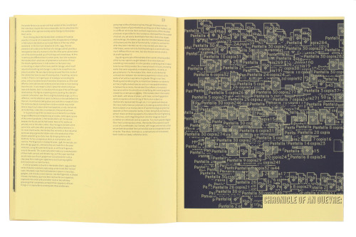
The project entailed designing a catalog for the work of José Antonio Hernández-Diez for his exhibition at the New Museum of Contemporary Art in New York. The museum had a total budget of approximately $30,000 for a 96-page book and yet we wanted to ensure that the catalog felt substantial. We chose to use an accordion fold that would allow us to wrap images from one page to the next in a formal nod to Diez’s video work and, in the process, give the book the feel of a 192-page book. We selected different papers for the text and art sections. The predominant colors used in the book are red (inside covers), yellow (text section paper) and blue (text section ink) in an acknowledgment of the artist’s nationality.
Juror Notes
“Provocative structurally, typographically, and as an object. Pages folded along the fore edge and repeated images are printed over plasticky stock, in contrast to the one-color text pages—that’s just right for this artwork.” Cheryl Towler Weese
“It is a book for skateboard kids. It is appropriately designed for its market.” Archie Ferguson
Credits
- Design firm
- Pure+Applied
- Creative directors
- Urshula Barbour, Paul Carlos
- Art directors
- Urshula Barbour, Paul Carlos
- Designers
- Urshula Barbour, Paul Carlos
- Picture editors
- Dan Cameron, Paul Carlos
- Authors
- Monica Amor, Dan Cameron, Jesus Fuenmayor, Gerard Mosquera
- Editors
- Johanna Burton, Melanie Franklin
- Publisher
- New Museum of Contemporary Art
- Trim size
- 9 x 12”
- Pages
- 96
- Quantity printed
- 5,000
- Compositor
- Paul Carlos
- Typefaces
- Commerce Gothic, FF Quadraat Sans, Steile Futura
- Printer
- SYL Creaciones Graficas y Publicitarias
- Papers
- Sappi Hanno Art Silk 300 gm cover, Arjo Wiggins Popset Maiz 90 gm text, Sappi Hanno Art Silk 90 gm
- Binder
- SYL Creaciones Graficas y Publicitarias
- Binding method
- Japanese binding with perfect-bound cover
- Book type
- Image driven


