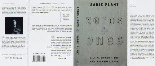
Zeros and Ones
Doubleday, New York, New York, 1996
Description
Since the publisher was looking to sell this as a feminist Being Digital, I wanted the cover to convey a relationship between women and machines. This was a tricky balance to maintain, since it could easily come out looking either too feminine (compromising the technological aspects) or too masculine (if the emphasis was too heavy on the machines). To capture the sterile, mechanized feel, it has a machine-pressed look. This is brought out by the cover material used—a stainless steel type foil.
Collections:
50 Books | 50 Covers of 1996
Discipline:
Book design
Format:
Book cover
Credits
- Design firm
- Doubleday
- Art director
- Amy King
- Jacket designers
- David J. High, Amy King
- Author
- Sadie Plant
- Typeface
- Franklin Gothic Condensed
- Printer
- Miken
- Paper
- 100 lb. C/1/S
- Publisher/client
- Doubleday
Loading...
Loading...