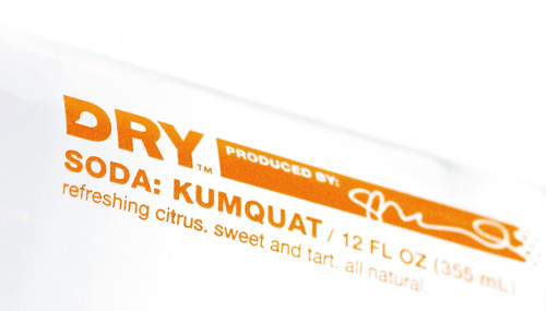
Dry Soda Bottles
Turnstyle, Seattle, Washington, 2005
Description
Created for those seeking a sophisticated nonalcoholic-beverage option, Dry Soda produces lightly sweet, all-natural gourmet sodas that were developed to be paired with great foods. With an aim to attract a discerning culinary audience, our design solution was intentionally minimalist, but with a sophistication that was still fresh and inviting. The initial brand experience was to be at premium restaurants, so the design had to be upscale and understated enough to feel well situated at a nice table setting. The clear bottle with simple, bold color supports this aim. The owner’s signature on each bottle denotes a sense of craft behind each flavor’s recipe.
Juror Notes
Understated, but in doing so, it makes the bottle and type really interesting.
Very simple—the color gives you the flavor profile.
Minimalist works because it makes it more pure.
It’s more believable in a glass bottle.
Credits
- Design firm
- Turnstyle
- Creative director
- Steve Watson
- Art director/designer
- Steve Watson
- Photographer
- Jay Dotson
- Printer
- Cello Print
- Printing method
- Screen-printed on glass
- Typeface
- Helvetica Neue
- Client
- Dry Soda Company


