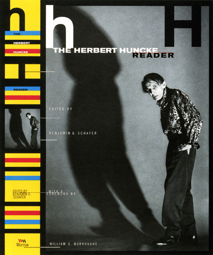
The Herbert Huncke Reader
Carin Goldberg Design, Stanfordville, New York, 1997
Description
Sometimes you get lucky and an art director provides a really nice image. What I saw in this photograph of Huncke was the relationship and scale between the diminished and hunched figure and the towering shadow. The symmetry of the first letters of Huncke’s name inspired a sort of monogram approach along with mimicking the large and small in the photo with cap and lowercase letters. The small type at the lower left was designed to suggest measurement or increments, again inspired by the scale in the photo.
Collections:
50 Books | 50 Covers of 1997
Discipline:
Book design
Format:
Book cover
Credits
- Design firm
- Carin Goldberg Design
- Art director
- Richard Aquan
- Graphic designer
- Carin Goldberg
- Photographer
- Christophe von Hohenberg
- Editor
- Benjamin G. Schafer
- Typeface
- Helvetica Trade Gothic
- Publisher/client
- William Morrow
Loading...
Loading...