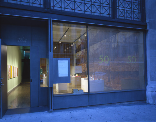
AIGA 50 Books/50 Covers of 2003 exhibition
State, New York, New York, 2003
Description
Since 1924, the AIGA book show has recognized excellence in book design and production. Categories range from trade, reference, and juvenile books to university and museum publications, and include limited-edition and special-format books.
The design challenge was to create an interesting context to display both the selected 50 three-dimensional book finalists as well as the 50 selected flat book cover finalists equally. In the past, the two categories of work in this exhibition—books and book covers—have been somewhat segregated from each other. The space also needed to be open and easily navigated. The audience consisted of the design community, in general, and members of the public visiting the gallery.
The approach I took was to create something of a gallery or installation for the exhibition—a space that was clean and open, yet had as much of a point of view as the work it contained, without getting in the way of that work. Using simple materials that related to the process of seeing and/or creating books, tables were designed and constructed with simple wood bases and stacks of pure white paper stock to display the work. The book covers were each mounted flush to blocks of the same wood to give them equal weight next to the other three-dimensional pieces in the show. Books and covers were then displayed randomly together atop these series of tables or platforms. Other details within the space included: a large panoramic visual (wallpaper) along one wall of deer walking through a forest of fallen leaves, as well as a small reading area with a coffee table, chair and lamp for more intimacy with the work.
Juror Notes
Contemporary spin, well thought through. A good example of how to design on a limited budget. The book cover solution shows consideration and follow through. The dimensionality was fun and added tangibility to the project. The trees on the wall and stacks of paper are provocative and add intrigue.
Credits
- Design firm
- State
- Creative director
- Todd Simmons
- Art director
- Todd Simmons
- Designer
- Todd Simmons
- Illustrator
- Todd Simmons
- Writer
- Richard Grefé
- Project manager
- Gabriela Mirensky
- Curator
- AIGA
- Fabricators
- Lisa Hein, Robert Seng
- Typeface
- Helvetica Neue
- Client
- AIGA


