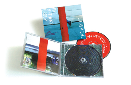
CD, The Way Up, Pat Metheny Group
Doyle Partners, New York, New York, 2004
Description
The Way Up is an extremely layered and complex 68-minute composition that has been described as “a vividly rendered journey, its mood shifting like scenes glimpsed from a fast-moving vehicle.” The audience, of course, was Pat Metheny lovers everywhere.
We thought it was important to represent this piece with variety, layers and storytelling while maintaining simplicity and cohesion. Plus we thought that illustrating the title, The Way Up, in this way and reorienting the booklet to become a vertical accordion was kinda fun. The artist liked the covers we did so much that the recording company was persuaded to print three alternate covers, with variations on front and back, adding up to six cover possibilities.
We chose poles as a subject in urban and rural settings to satisfy a sense of narrative and shifting moods. The poles also acted as a thread that wove the entire package together to represent the album’s concept of being a single composition.
The album changed the lives of Metheny-heads everywhere.
Credits
- Design firm
- Doyle Partners
- Creative director
- Stephen Doyle
- Designer
- Brian Chojnowski
- Photographers
- Brian Chojnowski, Stephen Doyle
- Copywriter
- Gregg Schaufeld
- Printer
- Ivy Hill
- Printing method
- Offset
- Typeface
- Interstate Condensed
- Client
- Nonesuch Records, Inc.


