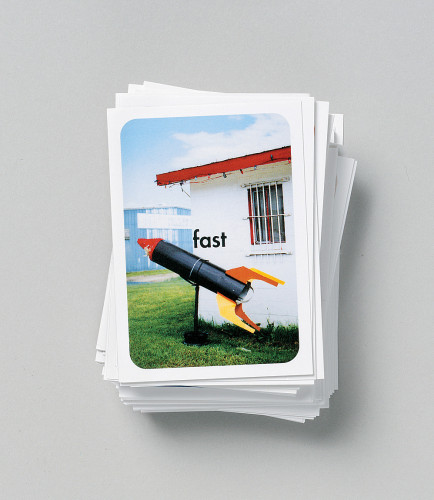
HP Invent identity system
Landor Associates, San Francisco, California, 2000
Description
The overarching goal for the HP identity program was to revitalize and re-establish Hewlett-Packard as the leading technology brand through a powerful, single brand identity. HP led this change with an advertising campaign by Goodby, Silverstein & Partners that included a new signature that simplified and added dimension to the familiar HP symbol and a new clean and uncluttered typeface. With this foundation, Landor developed a system that is open and honest. The words and pictures that tell HP stories are captured in a holding device called an “idea unit,” and the shape of this unit is founded on the rectilinear, soft-cornered shape of the familiar HP symbol. The distinctiveness and power of the design system comes from the orderly and purposeful repetition of this shape, a unique approach to imagery, a dynamic and broad color palette and the combination of clear yet thought-provoking words, graphics and images.
Credits
- Design firm
- Landor Associates
- Creative director
- Margaret Youngblood
- Senior design director
- Patrick Cox
- Designers
- Frank Mueller, Paul Chock, Christian Guler, Jean Loo
- Writers
- Mark Welte, Daniel Meyerovich, Susan Manning
- Account directors
- Hunter Marshall, Peter Mack, Brett Mangels, Liz Magnusson
- Project management
- Scott Briefer
- Realization
- Wayne DeJager, Brian Green, Monica Lee, Rose Robinson, Russell DeHaven, Judy Wurstler, Emma Rybakova
- Client
- Hewlett-Packard Company


