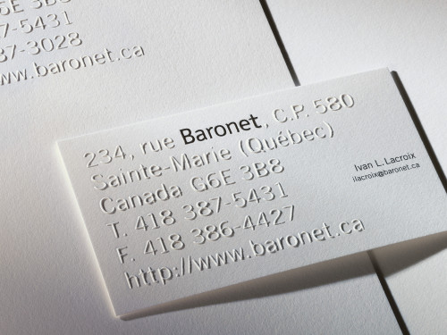
Baronet Stationery
Paprika, Montreal, Quebec, 2003
Description
For more than 60 years, Baronet has been a lot more than just another Canadian furniture manufacturer. The company’s furniture collections have consistently delivered a unique vision of the world, not just literal renderings but artistic expressions of essential design qualities—the shapes, curves, lines and textures that we associate with special places in the world.
Baronet draws on a rich creative woodworking tradition that encompasses historic classicism and cutting-edge contemporary design, as well as harmonies that abound in the many national and international styles that make up our global village.
The collaboration between Baronet and Paprika goes back 14 years and includes corporate identity, logos, stationery, catalogs, invitations, magazine ads and even environmental design projects. This mandate to review the identity program was a thrill for us because the company is in a state of continual evolution and it’s essential that their communication tools keep pace with any changes.
When working on identity, logo and stationery programs, we always begin the creative process by looking for anything unusual that might relate to the project, opportunities to work with something exclusive to the client. Was it not McLuhan who said that the obvious never is obvious? We have known for many years that Baronet was located on Baronet Street and never work on that premise. It doesn’t get any more exclusive than that!
After many different designs, we decided to go white embossed for everything except the Baronet name/logo, which is printed in black as well as being embossed. Of course, we also developed 2-color PMS print applications for special needs, including e-mail and faxing.
The Baronet values have helped to build up a very strong brand over the years. The same values have always provided a solid foundation for the creative process, leading to a style that’s distinct, daring, and contemporary…just like the company itself. Sticking with the original logo helps maintain a link with the past while opening up to a future where change and innovation are inevitable.
Although it’s hard to measure the exact impact of the stationery, Baronet has received a steady stream of compliments for the look, especially from American and European customers. The business cards were a big hit at recent furniture shows. Baronet customers have high expectations and those expectations are a great inspiration to us to develop our creative potential to the fullest.
Credits
- Design firm
- Paprika
- Creative director
- Louis Gagnon
- Art director
- René Clément
- Designer
- René Clément
- Printers
- L.G. Chabot, Gravure Choquette
- Printing method
- Embossing (logo), blind embossing (address)
- Papers
- Strathmore Writing Ultimate White 160M without watermark, Strathmore Bristol Wove 220M Ultimate White cover
- Typeface
- Trade Gothic
- Client
- Baronet

