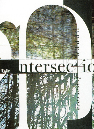
U&lc Magazine (Vol. XXIII, No. IV, Spring 1997)
Johnson & Wolverton, Portland, Oregon, 1997
Description
We were apprehensive about the prospect of designing an issue of U&lc, since the body of ITC’s typography is not reflective of current developments in the world of type. We were aware of the wit and lyricism of the U&lc that Herb Lubalin created and subsequently of the way Emigre and others have eclipsed the role that ITC and U&lc had played. How the publisher could claim a position of relevance was unclear.
Since the issue focused on concurrent global trends in graphic design, we showed the various articles concurrently rather than sequentially. Harmonious layers reflect harmonious design. Dissonant layers reflect dissonant design trends. The grid was based on the breaking down of the ITC Bodoni Old Style family (6, 7, and 12)—a claim ITC could make to relevance—and was influenced by classic map and timeline metaphors and constructions. This issue inspired empassioned letters to the publication, quite mixed—another installment in the ongoing philosophic debate in design between old and new.
Credits
- Design firm
- Johnson & Wolverton
- Art directors
- Alicia Johnson, Hal Wolverton
- Graphic designers
- Hal Wolverton, Heath Lowe, Robin Muir
- Client
- U/lc, International Typeface Corporation


