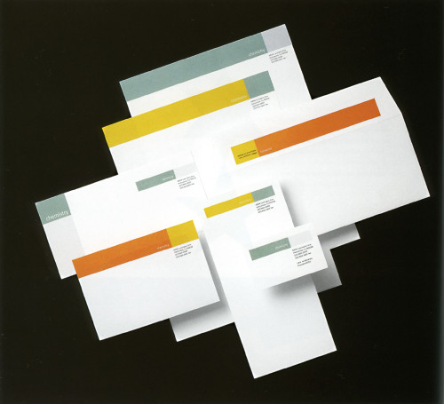
Chemistry Stationery
Ph.D., Santa Monica, California, 1998
Description
This particular commercials production company had struggled to come up with a name that would help to reposition an existing company, Harmony Pictures, and reveal the new direction in which it was headed. Chemistry—and all that the word suggests—was chosen. The graphic identity needed to be stylish, charming, and open ended. In remembering what we thought was magical about the name, we came upon the notion of evoking the simplest, most wonderful chemistry experiment: the litmus test.
Collections:
Communication Graphics: 20 (1999)
Discipline:
Brand and identity systems design
Format:
Stationery
Credits
- Design firm
- Ph.D.
- Art directors
- Clive Percy, Michael Hodgson
- Designer
- Clive Percy
- Typefaces
- Meta, Interstate
- Printer
- Foundation Press
- Paper
- Mohawk Superfine Text and Cover
- Client
- Chemistry
Loading...
Loading...