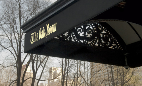
The Oak Room Identity
Pentagram, New York, New York, 2008
Description
The landmarked Oak Room in New York’s Plaza Hotel reopened in 2008 after an extensive renovation that updated the restaurant’s original 1907 wood—paneled interior to appeal to a new generation of genteel patrons. Although modern touches abound, we made a decision at the outset to channel the restaurant’s great iconic history. Our graphic identity, commissioned in conjunction with the renovation, was inspired by the original Oak Room and Oak Bar logos. These each featured Fraktur—style lettering, but the existing examples and the historical archives revealed little consistency. We carefully redrew the letters to create new logotypes for each venue, and also created something new: an O monogram, flanked by acorns, used as a secondary logo and repeat pattern on fabrics and finishes. The colors and materials specified for menus, matchbooks and other items coordinate with the accents of copper and green of the interior design.
Juror Notes
Elegant, appropriate, well crafted and exquisitely applied.
Credits
- Design firm
- Pentagram
- Art director
- Michael Bierut
- Designers
- Michael Bierut, Yve Ludwig
- Typefaces
- Custom Logotype, Gotham
- Client
- The Oak Room


