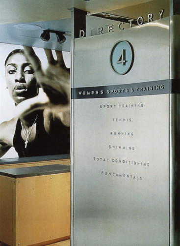
Niketown NY Identity System
Nike, Inc., Beaverton, Oregon, 1996
Description
With its flagship opening in Manhattan, Nike needed a new identity system for its Niketown stores. The architecture of the new store was inspired by WPA-era school gyms from across the country. In contrast, the interior of the store is a futuristic environment of interactive displays and athletic/sports-inspired stores. Our goal was to come up with an identity system that would merge these feelings of nostalgia and anticipation (old vs. new).
Nike designers studied the type styles of the 1930s, especially those seen on the architecture of midtown Manhattan. The result was a custom typeface that would be used for all store identity functions, including the logo, packaging, signage, apparel, and all printed materials.
Collections:
Communication Graphics: 18 (1997)
Repository:
Denver Art Museum
Discipline:
Brand and identity systems design
Format:
Brand identity, Exhibit, Graphical interface, Signage, Type design, Artifact
Credits
- Design firm
- Nike, Inc.
- Creative directors
- Val Taylor-Smith, Jeff Weithman
- Graphic designers
- Clint Gorthy, Val Taylor-Smith, Michael Hernandes
- Writer
- Bob Lambie
- Typeface
- Custom Niketown NYC (NTNYC 5.0)
- Printers
- Diversified Graphics, Setpoint
- Client
- Nike, Inc.
Loading...
Loading...