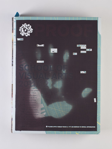
SVA Undergraduate Catalogue 2011–12
Anthony P. Rhodes, New York, New York, 2010
Description
Project brief: To show prospective students why SVA is the preeminent training ground for the next generation of artists. We want to prove that SVA, located in New York City, is the best art school to attend.
Approach: Our solution is to present visual and factual evidence, first by giving dozens of facts about New York, SVA and its students, and then by presenting hundreds of examples of student work throughout the book. We also employ a unique, heat-responsive ink on the cover, and with the application of heat (such as from one’s hand), a map of the school is revealed.
Effectiveness: The SVA Undergraduate Catalogue is now in its third year in this format. During SVA’s recruiting period using this catalogue model, they have seen an increase in applications to the school by 22.5 percent. This piece has garnered awards and recognition from design competitions. We have had numerous inquiries regarding the paper stock from printers, designers and other schools. The catalogue is still lightweight, despite its size and at over 600 pages.
Juror Notes
A complete capture of the artistic-minded creative millennial.
Credits
- Creative director
- Anthony P. Rhodes
- Art director
- Michael J. Walsh
- Designers
- Suck Zoo Han, Brian E. Smith, E. Patrick Tobin
- Editor
- Sheilah Ledwidge
- Client
- School of Visual Arts
- Design firm
- Visual Arts Press, School of Visual Arts


