


The Fine Art of Letters
Jerry Kelly LLC, New York, New York, 2000
Description
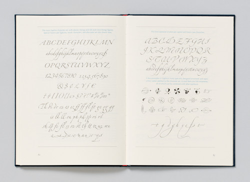
This publication was intended to display some of the achievements in the fields of calligraphy, type design, book design and typography of the noted German graphic artist Hermann Zapf. It was published to coincide with an exhibition of Zapf’s work at the Grolier Club in New York. A special challenge was staying fairly close to the great variety of the original colors, while printing only part of the book in full color and using flat colors elsewhere. The book was set in the elegant Zapf Renaissance type (for the text) with Zapf’s latest alphabet design—the script type Zapfino—used for the headings. This is probably the first use of Zapfino for a book-length project. In the end, I think the book achieved its goal of displaying lesser-known Zapf works to a larger audience, thereby giving some hint of the extent of his artistic achievement.
Credits
- Design firm
- Jerry Kelly LLC
- Art director/illustrator
- Hermann Zapf
- Designer/production coordinator
- Jerry Kelly
- Trim size
- 8 x 11 1/16 inches
- Quantity printed
- 1,000
- Compositor
- Jerry Kelly
- Typefaces
- Linotype Zapfino, Zapf Renaissance
- Printer
- Finlay Printing
- Paper
- 80 lb. Mohawk Superfine Softwhite Smooth
- Binder
- Acme Bookbinding
- Binding method
- Smythe-sewn, case-bound
- Binding materials
- Brillianta
- Endpapers
- Fabriano Ingres
- Author
- Hermann Zapf
- Publisher
- The Grolier Club