Radar
Aufuldish & Warinner, San Anselmo, California, 2006
Description
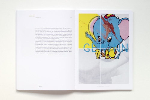
RADAR: Selections from the Collection of Vicki and Kent Logan was the opening exhibition in the Anschutz Gallery of the Denver Art Museum’s new Frederic C. Hamilton Building, and this project is the exhibition catalogue. The curators chose RADAR as the title to describe the Logans’ vision: radar as “a spotlight that could cut through fog.”
I was fortunate to work directly with the museum’s curatorial team. They were able to articulate their thinking behind naming the exhibition RADAR, which led to many of the ideas I used in the project design—from the macro choice of cover image (is that the Mona Lisa or not?) to the micro choice of typefaces. I often build a project out from the typeface selections, and in this case it was especially interesting to use type to subtly reinforce the ideas behind RADAR.
Juror Notes
“Packaging is a really good showcase for the art inside.”
Credits
- Design firm
- Aufuldish & Warinner
- Designer
- Bob Aufuldish
- Photographers
- Kevin Hester, others
- Production artist
- Michael Thompson
- Production coordinators
- Nerissa Dominguez Vales, Sue Medlicott
- Authors
- Gwen F. Chanzit, Gary Garrels, Kent A. Logan, Vicki Logan, Dean Sobel, Dianne Perry Vanderlip
- Editor
- Laura Caruso
- Trim size
- 8 x 11 inches
- Pages
- 232
- Quantity printed
- 5,000
- Compositor
- Aufuldish & Warinner
- Typefaces
- Adobe Caslon Pro, Avenir, Retina
- Printer
- Trifolio
- Papers
- GardaMatt 150 gsm, Yupo transparent 92 gsm
- Binder
- Real Lachenmaier
- Binding method
- Smyth sewn with exposed binding
- Publisher/client
- Denver Art Museum


