Polar Bear Night
Scholastic Inc., New York, New York, 2004
Description
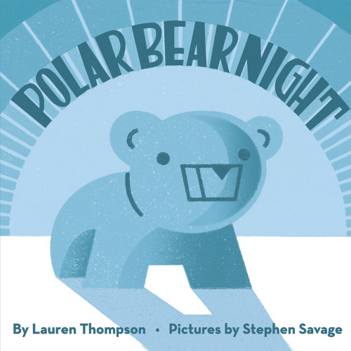
Whenever I design a children’s picture book, my ideas about the typography and layout originate with the artwork. In this case, Stephen Savage’s linocut prints hark back to classic children’s books of the 1930s and 1940s. Setting the text in a simple but warm sans serif typeface (Neutraface) echoed the simple lines in the artwork and gave a clean, spare look to the pages. The title type was hand lettered by Kevin Pyle, a lettering artist I’ve worked with before. He and I looked at unusual Deco-period typefaces and then created a hybrid based on details we liked. Having the display type on the jacket and title page follow the curves in the artwork was a natural choice to complement Stephen’s bold compositions. And finally, by printing the book on uncoated paper and using a soft, matte finish for the jacket, I tried to capture the look and feeling of Stephen’s original linocuts. This particular book was an unusual experience for me because as editor, designer and art director, I was truly involved with every aspect of the book. Perhaps for that reason—being my own client, so to speak—Polar Bear Night has a strong, clear design that allows the words and pictures to speak more directly to readers. Happily, it became a New York Times bestseller and was named a New York Times Best Illustrated Book.
Credits
- Design firm
- Scholastic Inc.
- Art director/creative director/designer
- David Saylor
- Jacket designer
- David Saylor
- Illustrator
- Stephen Savage
- Author
- Lauren Thompson
- Editor
- David Saylor
- Publisher
- Scholastic Inc.
- Trim size
- 10 x 10 inches
- Pages
- 32
- Quantity printed
- 10,000
- Compositor
- David Saylor
- Typeface
- Neutraface Text Bold
- Printer/binder
- Tien Wah Press
- Jacket printer
- Tien Wah Press
- Paper
- Inside—Glossy Artpaper, 135 gsm. Jacket—Glossy Artpaper, 150 gsm, Opp matte film laminated
- Binding method
- Smyth sewn


