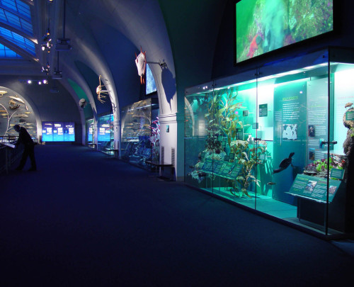
Hall of Ocean Life exhibition
American Museum of Natural History, New York, New York, 2003
Description
In 2003,the American Museum of Natural History completed a major renovation of its Hall of Ocean Life. The goal of the new hall is to dazzle, engage and educate the public about the complexity of the oceans and their importance in supporting life on Earth. One challenge was integrating new themes, displays and technology without diminishing the hall’s previous appeal. The central icon of a full-size blue whale remains the centerpiece of the 29,000-square-foot hall, but ripple lighting and an aquatic soundscape now suggest a vast underwater space. Touchable models, high-definition video projections and interactive computer stations blend in with the classic dioramas, while eight new ecosystem displays and two immense evolutionary trees create a new focus on biodiversity.
The current design presents a new and very different vision of the ocean and its inhabitants. Eight monumental arches were restored and enhanced to present eight different ocean ecosystems. As soon as one enters the room, these distinctly different ecosystem displays convey at a glance one of the central messages of the hall: the surprising diversity of marine ecosystems and the rich variety of interconnected species living within them.
The new presentation contradicts the common perception of the oceans as a distant, monotonous, monochromatic environment. Through compelling visual displays, coupled with roughly 40,000 words of text, the hall introduces the diverse habitats and inhabitants of the oceans, which in many ways outstrip their terrestrial counterparts in variety and complexity. The interconnections among ocean species and habitats are explored in many ways, accompanied by numerous stories about the impact of humans on the ocean world.
The most ambitious design work was devoted to the ecosystem displays, which echo the look and feel of the classic dioramas on the floor below, but with many significant innovations. The goal was to reinterpret the diorama through a contemporary sensibility while making reference to the classic conventions of the form. The challenge was to create something wholly different and modern that could stand on its own but also coexist with the traditional dioramas that live on the lower level, spruced up but otherwise left intact. The end product is a synthesis of both traditional and contemporary methods of display.
In the traditional diorama, no text or graphic panels intrude in the simulated naturalistic space. This constraint drastically limits opportunities to explicate the densely packed visual information or explore related issues such as humanity’s impact on the environment. In the new format, graphic panels are incorporated inside the cases, offering immediate explanations for the hundreds of models. Unlike traditional dioramas, which portray a specific place and time, the new ecosystem displays present many distinct points in time and space side by side. Such simultaneity does not exist in nature, yet the designers still strove to create a unified look and feel, a delicate balancing act.
A key challenge of designing such an information-rich permanent hall was that it must reward visitors strolling by as well as visitors who read for hours on repeated visits. Numerous short, self-contained labels offer brief but satisfying stories, while the lengthier labels include clear introductions, highlighted pull sentences, and boldfaced key phrases, so readers can determine the subject at a glance.
The American Museum of Natural History has historically been acknowledged as the world’s leading practitioner of the traditional diorama format. In departing so boldly from its own successful history, the museum’s design team has created a fundamentally different model for presenting visual information in a natural history museum. We believe that this new approach retains the best of the past, while offering a significant advance in the way we present scientific information to the public in a manner that is both artful and engaging.
The budget was approximately $25 million.
Juror Notes
Respected the legacy and memory of the old space and brought it forward to take advantage of new technology and scientific advances. Spectacular lighting. It is a daunting challenge to design an exhibit this big. The orchestration of the experience is thought out.
Credits
- Design firm
- American Museum of Natural History
- Creative director
- David Harvey
- Art directors
- Tim Nissen, Stephanie Reyer
- Designers
- Pei Hsieh, Iris Jan, Hartmut Jordan, Chad Marchese, Jay Zagoren
- Illustrator
- Plankton Art Co.
- Production coordinators
- Steve Quinn, Caroline Seitz
- Picture editors
- Jen Cooke, Sarah Wilson
- Editor
- Lauri Halderman
- Writers
- Karen de Seve, Martin Schwabacher
- Media producer
- Geralyn Abinader
- Content strategist
- Lisa Grossman
- Project manager
- Dina Langis
- Curators
- Neil Landman, Mark Siddall, Melanie Stiassny, Robert Voss
- Fabricator
- Hadley Exhibits
- Typefaces
- Cheltenham, Clarendon, Kievit
- Client
- American Museum of Natural History


