


Iron at Winterthur
Studio Blue, Chicago, Illinois, 2005
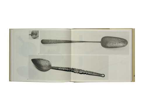
Description
We wanted to design a book that conveyed the gritty resilience of cast-iron objects, which were often used because they could withstand extreme temperatures and conditions. We used extremely large type and black solids, along with details that highlighted the surfaces and textures of cast iron. We also wanted to evoke a sense of a past when the only advertising was print, and tone was conveyed through typographic nuance, so we created “broadsides” using type excerpts as section dividers.
Juror Notes
With its bold type treatment and in-your-face duotone images that are as strong as the subject, Iron rises above the genre of hefty museum catalog, where the type typically takes a polite backseat to tan-colored” images. The decision to forgo color here was maybe a risky one, but one that paid big dividends, creating a museum catalog in which subject and design are commonly, but surprisingly, joined.
Credits
- Design firm
- Studio Blue
- Creative directors
- Kathy Fredrickson, Cheryl Towler Weese
- Designers
- Tammy Baird, Cheryl Towler Weese, Maia Wright
- Photographers
- Lazlo Bodo, George J. Fistrovich
- Production coordinator
- Carolyn Heidrich
- Author
- Donald L. Fennimore
- Trim size
- 11 x 9.5 inches
- Pages
- 428
- Quantity printed
- 2,000
- Typefaces
- Tribute, OL Franklin Wide, Bureau Grotesque
- Papers
- Biberist Allegro Silk, Invercote Creato Matte
- Binding method
- Smyth sewn
- Publisher/client
- Winterthur Museum