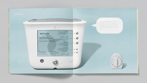
Audrey brand identity
Turner Duckworth, San Francisco, California, 2000
Description
Audrey isn’t a computer, it’s an Internet appliance, and our challenge was to market sophisticated technology for the home in a distinctive and unintimidating way—to make people think of Audrey the way they would a dishwasher or toaster. We used neglected communication opportunities like the user manual and packaging to make even the most technology-challenged consumers comfortable with Audrey. The approach of engaging and explaining using clarity and wit was continued in point of sale displays designed to look like a slice of a kitchen, brochures covered in the familiar junk from kitchen drawers and invitations that used a blender to explain Audrey’s functions. Packaging had to be merchandized on shelves of limited space; box height and depth were a concern. Also stackability, ease of shipping and ease of shelf replenishment were taken into consideration. We also worked with packaging specialist to design the interior foam that protects Audrey.
Credits
- Design firm
- Turner Duckworth
- Creative directors
- David Turner, Bruce Duckworth
- Designers
- David Turner, Mark Waters, Sara Geroulis, Mary Foyder, Allen Raulet, Jonathan Warner, Lian Ng
- Photographers
- Stan Musilek, Lloyd Hyrciw
- Illustrator
- Brian Cronin
- Typeface
- Trade Gothic
- Printers
- ExpedEx/Advanced Litho, Glenbard Printing, Paper N Inc
- Client
- 3Com Corporation


