Identity, Walker Without Walls
Walker Art Center, Minneapolis, Minnesota, 2004
Description
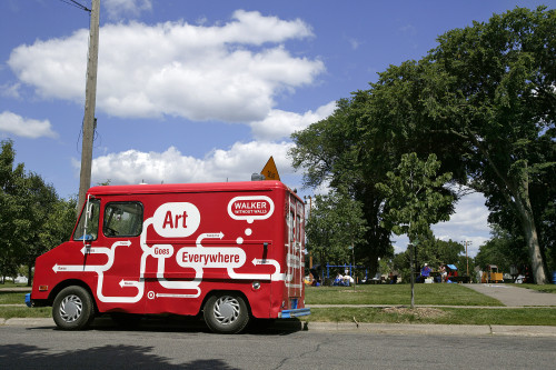
The Walker without Walls identity and campaign were created to address the challenge of maintaining the visibility of the Walker Art Center and its ongoing programming while the building was closed for expansion and renovation during 2004.
The campaign appeared in locations throughout the city and across media platforms—public transit stops, billboards, sidewalk stencils, portable signage, wall graphics, and even an ice cream truck—and on a variety of print and on-line materials designed to promote the year in general and specific programs.
The identity draws upon the visual language of street signs, board games, and mapping for its inspiration. Its kit-of-parts is a set of standardized forms (curves, arrowheads, bubbles), which can generate endlessly flexible compositions. The Walker Without Walls identity is overlaid onto pre-existing designs (Walker calendar, letterhead, web site, tourist postcards, etc.), on the physical environment (sidewalks, walls), and as a treatment across advertising space. The personality of the identity conveys the expansive nature of the Walker’s programming with a sense of playfulness. The campaign succeeded in increasing awareness of the Walker and its programs, helping to maintain and increase our event audiences during the year.
Credits
- Design firm
- Walker Art Center
- Creative director
- Andrew Blauvelt
- Designer
- Alex DeArmond
- Photographers
- Cameron Wittig, Gene Pittman, et al.
- Production director
- Lisa Middag
- Production artists
- Greg Beckel, David Naj
- Editors
- Pamela Johnson, Kathleen McLean
- Printer
- Various
- Printing method
- Various
- Paper
- Various
- Fabricator
- Various
- Manufacturer
- Various
- Typefaces
- Walker, Helvetica Rounded
- Client
- Walker Art Center


