Chicago, poster
John Berg, Columbia Records, 1971
Description
Juror Notes
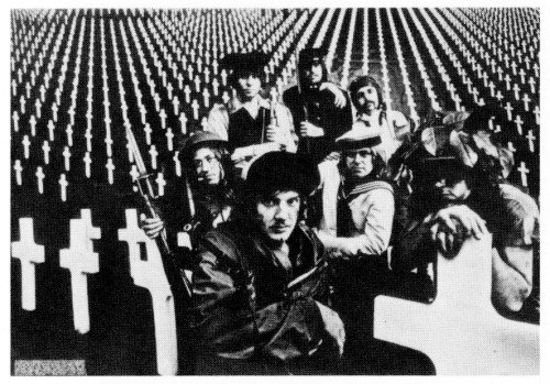
This is a nicely designed photograph; also groovy looking;
which raises the same problem. This is designed as an anti-
war poster. . . but it looks like an ad for a rock group in
Rolling Stone. The crosses, presumably, symbolize death in
war, but they're really quite lovely, seen in that perspective.
The message in the lower lefthand corner doesn't intrude in
the slightest. All of these effects may have been created
intentionally. The overall effect is to make the anti-war
movement seem like a rather pleasant diversion, which for
many people, of course, it is. —Tom Wolfe
Maybe seven crosses and seven soldiers against a
photomural of crosses without end, in contrast to the
small type. . . a catalogue of casualty figures, of numbers
of torn bodies under neat white crosses.
—Gene Federico
Credits
- Art director
- John Berg, Columbia Records
- Designer
- John Berg, Columbia Records
- Photographer
- Horn/Griner
- Client
- Columbia Records