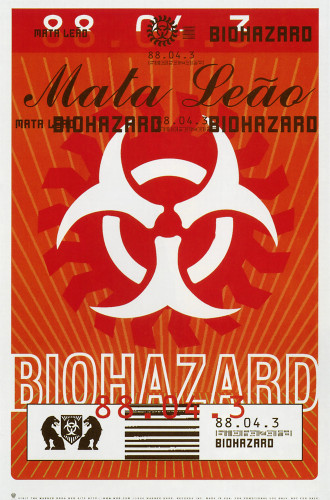
Biohazard “Mata Leão” Poster
Warner Bros. Records, Burbank, California, 1996
Description
The poster is focused on the band’s existing logo, reinforcing it with a newly elegant surrounding graphic that has not been linked before with Biohazard.
The logo, title, and the band name are meant to be read first, with a second layer of industrial noise that would define the music for the intended buyer. Orange was the obvious choice, as it naturally connects with the Biohazard logo and was insisted on by the band for that reason. This project was meant to work both as a decorative marketing poster and a street snipe, which of course needs to be striking and readable from quite a distance. In that respect, I think it was quite a success.
Repository:
Denver Art Museum
Discipline:
Promotional design and advertising
Credits
- Design firm
- Warner Bros. Records
- Art director/designer
- Deborah Norcross
- Photographer
- Amy Guip
- Client
- Warner Bros. Records
Loading...
Loading...