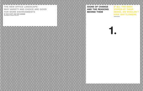
“The Potential of Place” issue, See
Cahan & Associates, San Francisco, California, 2004
Description
The task at hand was to reinforce Herman Miller as a knowledge leader in its industry and affirm its connections with the architecture and design community. We created a new approach to periodical design by combining innovative images, graphic treatments and substantial copy in coherent but unpredictable ways.
A periodical published twice a year, containing longer essays (“Features”) and shorter, widely disparate treatments of a single subject (“Perspectives”), SEE varies in length, theme and direction with each issue. Salespeople use SEE as a significant point of contact and conversation starter with customers; each issue of SEE becomes a public record of Herman Miller’s research and views about the built environment.
SEE has earned a number of awards, and the recognition from our dealers, sales field and customers has been extremely positive. A few awards include International Paper Best on Press Gold Award, Distinctive Merit Award from 84th Annual Art directors Club, and Gold Award from the Society of Publication Design. SEE contains articles about environmental advocacy, which is part of Herman Miller’s heritage; the publication is recyclable, the paper stock chosen has 20 percent post-consumer waste content, and the inks used were Eco pure™ soy-based inks.
Credits
- Design firm
- Cahan & Associates
- Creative directors
- Bill Cahan (Cahan & Associates), Steve Frykholm (Herman Miller, Inc.)
- Art director/designer
- Todd Richards
- Illustrators
- Gary Clement, Joseph Hart, Jonathon Rosen
- Photographers
- Dwight Eschliman, Andy Sacks, Robert Schlatter, Kenji Toma
- Production directors
- Marlene Capotosto, Clare Rhinelander
- Production artist
- Nicholas Davidson
- Editor
- Clark Malcolm
- Writers
- Miriam Beyer, Andrew Bode-Lange, Anne Coulter, Chris Dombrowski, Kirk Donnan, Rick Duffy, Don Goeman, Susan Hessler, Beth Kling, Katherine Paarlberg, Julie Ridl, Steve Shilling, Sally Smits, Mike Theune, Naomi Tsukamoto, Linton Weeks
- Project manager
- Gay Strobel
- Printer
- The Hennegan Company
- Printing method
- Offset
- Binder
- The Hennegan Company
- Binding method
- Perfect bound
- Papers
- International Paper, Via, Bright White, 70 lb. text, smooth, Via, Bright White, 80 lb., cover
- Typefaces
- Helvetica Neue, Sabon, Helvetica Rounded
- Client
- Herman Miller Inc.


