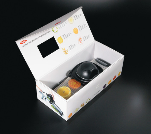
Packaging, OXO Good Grips Mandolin
OXO International In-House Design Group, New York, New York, 2004
Description
At the start of this project, it became clear that three major goals needed to be achieved through the package design:
Safety—The Mandoline contains several parts with sharp blades. We designed a box that consisted of an inner corrugate box for support and an outer cardboard box for graphics. Hiding the inside corrugate structure allowed for a more expensive presentation. This kind of structure has also proven durable and has held up nicely at retail. An acetate window creates a transparent barrier between the product and consumer.
Communication—Because most consumers are not aware of mandolines or what they are used for, we had to communicate how this product could fit into their daily life at first glance. Photographs illustrated the Mandoline in use and showed many different slices of food that could be created with it. The bottom of the box clearly explains all of the Mandoline’s features and benefits.
Approachability—Our market research had shown that most consumers do not own a mandoline because they have always thought mandolines to be dangerous and intimidating. We concluded that this was due to the competitors’ complicated product design, unfriendly packaging design, and high price points. We wanted to convince the consumer not only that OXO’s Mandoline was easy and safe to use, but also that it could make their everyday life easier and fun. The sliced-food imagery brought color to the box and a sense of playfulness. The product appears friendly and approachable. The Velcro lid was designed so that the consumer could interact with the packaging quickly.
To date, the Mandoline has been one of OXO’s most successful product launches, representing more than five percent of our sales during the first five months of selling.
Credits
- Design firm
- OXO International In-House Design Group
- Art director/designer
- Stacie Remaly Wolfe
- Designers
- Packaging Resources, Art Bezrutczyk, Inc.
- Photographer
- Dan Wilby Photography
- Copywriter
- Michelle Sohn
- Printing method
- Offset
- Paper
- SBS White, with glossy polypropylene lamination
- Typeface
- Futura Condensed
- Client
- OXO International


