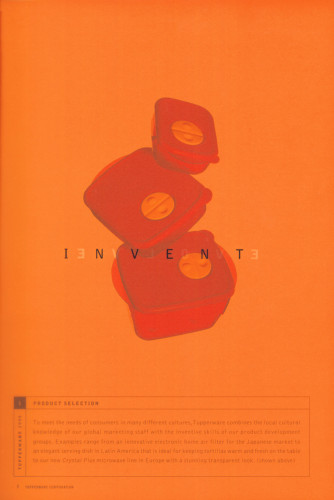
Tupperware 1999 Annual Report
SamataMason, Inc., Dundee, Illinois, 1999
Description
By showing evolution in every aspect of the Tupperware Corporation—from product design and selection to sales force and distribution—I was able to show that the company is up to date. I decided to use the bright colors that are seen in Tupperware products and translucent paper to represent their look and feel.
Collections:
AIGA 365: 21 (2000)
Repository:
Denver Art Museum
Discipline:
Corporate communications design
Format:
Corporate communication, Booklet
Credits
- Design firm
- SamataMason, Inc.
- Art director
- Greg Samata
- Graphic designer
- Steve Kull
- Print production
- Ann Teson
- Photographers
- Sandro (main products), Marc Norberg (executive), Mark Craig
- Writer
- Laurence Pearson
- Typefaces
- Bell Gothic, Folio
- Trim size
- 7 1/2 x 10 1/2 inches
- Printer
- H. MacDonald Printing
- Paper
- Fox River Coronado Bright White Vellum; Fox River Sundance Smoke Smooth; and Appleton Lucence
- Client
- Tupperware Corporation
Loading...
Loading...


