Matre Productions Stationery
Haley Johnson Design Co., Minneapolis, Minnesota, 1997
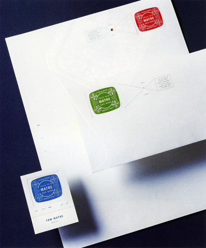
Description
This stationery system was inspired by the dual capabilities offered by Matre, film and print. A screen test pattern was the inspiration for the logo. The use of red, green, and blue on alternate items of the stationery system relates to the three colors used on the TV screen, from which all other colors are made. The technical drawing of projection, and the use of metallic silver, refer to the print side of Matre’s business.
Collections:
Communication Graphics: 19 (1998)
Repository:
Denver Art Museum
Discipline:
Brand and identity systems design
Format:
Brand identity, Stationery
Credits
- Design firm
- Haley Johnson Design Co.
- Art director
- Haley Johnson
- Graphic designer
- Richard Boynton
- Typefaces
- Trade Gothic, Garamond
- Printer
- Flair Print Communications
- Papers
- Mohawk Superfine 70# Text, Ultrawhite Smooth
- Client
- Matre Productions
Loading...
Loading...