Herdeiros Passanha
Base Design, Michael Young, New York, New York, 2008
Description
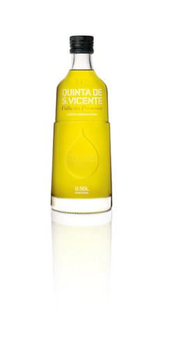
In designing the new Passanha identity, we created a round drop icon to hint at the purity and “round” flavor of pressed oil. We then brought in English industrial designer Michael Young to design the bottle in three sizes. In our brief to Michael we specified that the bottle should incorporate our round drop and emphasize the oil and its color. To represent the olive press, the bottle is divided into upper and lower parts by a horizontal ridge, with the drop just below.
We incorporated a contemporary stencil typeface to serve both as a modern type and a reference to the handmade (and to Porto). For the rest of the identity, we used photographic imagery of the stunning property of La Quinta, and a warm, elegant color palette of pale cream, olive green and black, with touches of bright yellow.
Juror Notes
The thoughtfulness of the custom bottle is what intrigued me. It is simple, yet communicates the feeling of high quality.
A modern interpretation of an olive-oil bottle. An ambitious customized bottle.
Stable and solid with surface textures that ask to be picked up.
Credits
- Design firms
- Base Design, Michael Young
- Manufacturer
- Vetreria Etrusca
- Client
- Herdeiros Passanha


