


Feathers
Basic Books, New York, New York, 2010
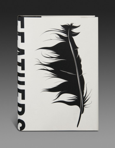
Description
Project brief: The author and editor requested an idea of a cabinet-of-wonders presentation that would include many feathers. I do love this cabinet idea, which is always so pleasing to the eye, but had seen it countless times over. The sales handle was the untold natural and cultural history of nature’s finest invention, so I thought this concept of using one single feather without a title would echo this and add some level of mystery. I also liked the idea of using just a black image and focusing on its form to show the feather in a new and unique way. The bird-watching market consists of a highly literate, book-loving and loyal audience. A beautiful, gift-like package would be appreciated and the lack of a title would only please them more, placing the emphasis on the feather itself. The writer is known as a fine new voice in natural history, described as brave and adventurous. The writings in this text are threaded with gentle humor, which works well with a cover of this kind. The cover needed to appeal to casual backyard nature observers, scientists, anthropologists, mountain climbers and archaeologists alike.
Approach: Once we were all on board with the single-feather idea, the search was on for the perfect feather. Should it be photographed or illustrated? I wanted to show the feather’s beautiful form and it became clear that the best way would be to use a silhouetted image. A deboss stamp would only emphasize the delicate edges and a soft uncoated stock would provide the perfect contrast. The editorial and marketing teams would not go for a cover without any title at all so I made the decision to bleed the letterforms onto the cover. The tops of the letterforms combine with the striking image and fill in the gaps. We went with a small trim size so that our bulk would be wide enough to use the typography in this way. I crossed my fingers and hoped that chapters would not be removed right before press! I decided upon a Mohawk Via Felt Cream White 100-pound paper stock that would support the deboss. We also allowed the deboss to fade up to paper level at the turns of the spine to avoid the stock from cracking once the book is jacketed.
Effectiveness: The concept is unique and the book will both stand out from the shelf and invite readers in with its mystery. It is beautiful and simple, a tactile object synonymous with a feather.
Juror Notes
An unusual choice of two bold gestures—type and graphic translation—for a delicate subject.
Credits
- Design firm
- Basic Books
- Art director
- Nicole Caputo