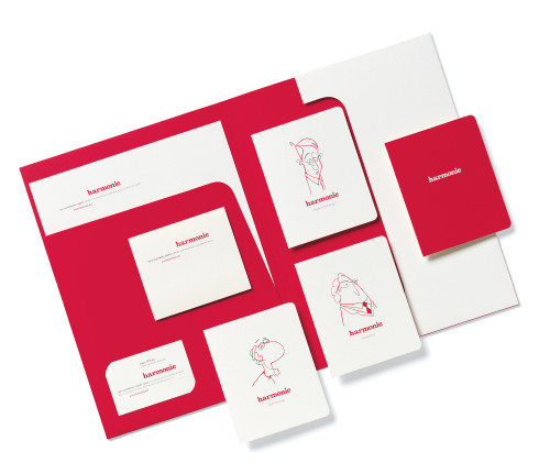
Harmonic identity system
Elsewhere Creative LLC, San Francisco, California, 2001
Description
Harmonic launched as a marketing firm offering advertising services and a software platform to automate the distribution of digital communications. Digital technologies require the collaboration of engineers, analysts and managers—three groups that have problems communicating with each other. The target audience—senior marketing management—was feeling these tensions acutely. Our solution was to focus on “harmony,” a high-level concept desirable in all team environments. The logo demonstrates that all the letters in the word are of equal value and works with the humorous, illustrated caricatures, the strong red color, the elegant paper stock and the classic, balanced type treatment, altogether creating a substantial presence.
Juror Notes
“Fresh, but not overdone. The typography is really good.”
Credits
- Design firm
- Elsewhere Creative LLC
- Creative director
- Marie Kacmarek
- Designer
- Brenna Ramirez
- Illustrator
- Flinch
- Typefaces
- Belizio, Proforma
- Printer
- Watermark Press
- Paper
- Gilbert Neutech
- Client
- Harmonic