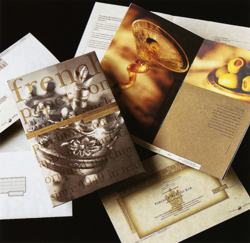
“Parched” French Parchtone Promotion
Studio D Design, Minneapolis, Minnesota, 1996
Description
Parchtone is one of Jerry French’s oldest paper lines, and mostly considered a non-designer sheet. However, Jerry wanted a promotion aimed at both printers and designers. This was a challenge considering the stigma attached to parchment paper. Printers use a great deal of Parchtone for certificates, announcements, letterheads, and menus, but designers usually don’t give this sheet a second look. I decided to create a piece based on a fictitious martini bar called Parched and include pieces that the printers could relate to producing, but design, format, and print them in a way that would invite designers to take another look at Parchtone.
Collections:
Communication Graphics: 18 (1997)
Repository:
Denver Art Museum
Discipline:
Promotional design and advertising
Credits
- Design firm
- Studio D Design
- Art director
- Laurie DeMartino
- Graphic designer
- Laurie DeMartino
- Photographer
- Steve Belkowitz
- Writer
- Lisa Pemrick
- Typefaces
- New Baskerville, News Gothic
- Printer
- The Etheridge Company
- Paper
- French Parchtone
- Client
- French Paper Company
Loading...
Loading...