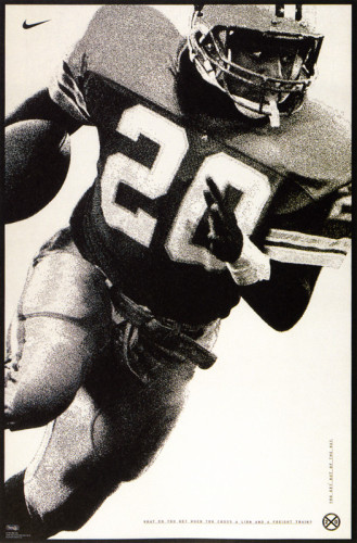
Barry Sanders Poster
Nike Design, Beaverton, Oregon, 1995
Description
The poster’s audience is young men. I wanted to make the poster simple and graphically strong. There was no photo shoot in the budget, so I found an NFL stock shot and converted it to black and white, took out the background and cropped the shot in a dynamic way. I wanted to strike a visual balance between grit and sophistication.
Collections:
Communication Graphics: 17 (1996)
Repository:
Denver Art Museum
Discipline:
Promotional design and advertising
Credits
- Design firm
- Nike Design
- Art director
- Dan Richards
- Graphic designer
- Dan Richards
- Photographer
- Peabody
- Writer
- Dan Richards
- Typographer
- Dan Richards
- Printer
- Irwin Hodson
- Paper
- Cougar Opaque
- Client
- Nike, Inc.
Loading...
Loading...