


Red Canoe identity system
Red Canoe, Deer Lodge, Tennessee, 2000
Description
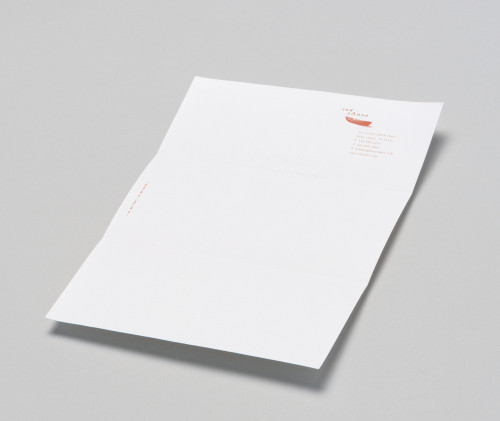
A design cabin/studio in the woods above a river, Red Canoe incorporates both “work” and “play” into one existence, hence the evolution of the mission statement into the trademarked tag line of “as we live—so we work.” The identity utilizes three warm colors used consistently, yet in both simple and bold contrasting manners. The actual red canoe in the identity is used sparingly, with more of a reliance on consistent type and color treatments to convey the Red Canoe identity. Words also proved to be a significant identity element. The various labels are used in a wide range of packaging applications: the “Connect” card functions equally well as a generic note card, thank-you card or as a large business card (with the Red Canoe mission statement printed on the back side); other small cards carry the weight of many identity assignments.
Credits
- Design firm
- Red Canoe
- Creative director
- Deb Koch
- Designer
- Caroline Kavanagh
- Writer
- Deb Koch
- Typefaces
- Clarendon, Officina
- Printer
- Lithographics, Inc.
- Paper
- Fox River Starwhite Tiara smooth and Evergreen Kraft
- Software
- Adobe Photoshop, Adobe Illustrator, QuarkXPress, Microtek ScanMaker, Agfa 1640 Digital Camera
- Client
- Red Canoe