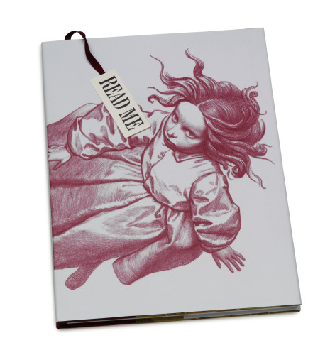
Alice in Wonderland
Steedman Design, Vancouver, British Columbia, 2003
Description
The primary challenge for Alice in Wonderland was to design an edition that would stand out in a market flooded with many original and exciting versions of this book. The challenge was to ignite the readers’ taste for the absurd and enchanting story in its original unedited version, to create a memorable and impressive collector’s edition. The audience includes adults already familiar with Alice and the imaginative young children they might read the story to.
The book aims to draw you into the eccentric and captivating tale with its size and enigmatic cover, whose only title is the bookmark’s invitation to “read me” (just as the story’s adventure begins when Alice drinks from a bottle labeled “Drink me”). The curious tale comes to life using exaggeration of scale, an ethereal color palette, and a tenuously balanced typographic grid, while giving greatest prominence to Ghiuselev’s illustrations. The design is at once traditional and innovative. Last, Friedrich Peter’s calligraphic titles allude to the gestural handwriting of Carroll’s original manuscript.
Juror Notes
“Giving a new interpretation of the classic tale in illustration and design is an ambitious project, and this one succeeds at it. Unfortunately, that is compromised by inferior production.” Jack Woody
Credits
- Design firm
- Steedman Design
- Creative director
- Judith Steedman
- Designer
- Judith Steedman
- Jacket designer
- Judith Steedman
- Illustrator
- Iassen Ghiuselev
- Production coordinator
- Judith Steedman
- Author
- Lewis Carroll
- Publisher
- Simply Read Books
- Trim size
- 9.5 x 13”
- Pages
- 120
- Quantity printed
- 5,000
- Typefaces
- Kennerly, and calligraphy by Friedrich Peter
- Printer
- Grafiche AZ
- Binding method
- Smyth sewn, casebound
- Book type
- Children’s


