The Vowels
University of Illinois at Chicago, Chicago, Illinois, 2003
Description
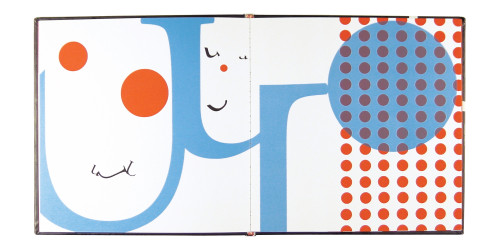
The objective was to create a visually engaging children’s book. The book introduces children to letterforms, in a starkly graphic manner. It invites children to look at and find pictures in abstractions and offers them an opportunity of seeing in a different way.
Simplicity in the use of typography, color, and printing are key in the design approach. The design leads children to interpret the typographic pictures as well as find individual letterforms.
The solution was created purely with letterform and shape. The vivid use of red and cyan brought these abstract forms to life. The book, 7.5 x 7.5 inches, is a small square for small hands. Silkscreened and bound by hand, it is offered gratis and used to promote the designer.
Juror Notes
“I wish you could smell this book. It’s a beautiful exploration of shape, color, scale and production. For children, it may be a better introduction to letterforms as building blocks rather than the building blocks of language.” Archie Ferguson
Credits
- Design firm
- University of Illinois at Chicago
- Designer
- Linda Bracamontes
- Jacket designer
- Linda Bracamontes
- Production coordinator
- Imelda Lizama
- Author
- Linda Bracamontes
- Trim size
- 7.75 x 7.75”
- Pages
- 24
- Quantity printed
- 300
- Typeface
- Adobe Garamond
- Printer
- Queretaro
- Papers
- Ivoline Opalina extra white 200g/m2, uncoated cover
- Binder
- Queretaro
- Binding method
- Perfect
- Book type
- Children


