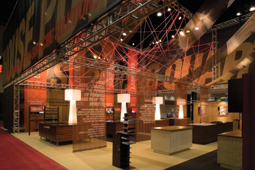
Formica trade stand, International Home Builders’ Show 2007, Environment
Kuhlmann Leavitt, Inc., St. Louis, Missouri, 2007
Description
The challenge was to design a space that would attract exhibit goers in a busy exhibit hall while communicating Formica Corporation’s wide product offering: Laminate, Solid Surfacing, Stone, Wood and Metal.
The inspiration for the design came from Formica’s leadership position in the surfacing industry—they are, in the home-builder market, an industry powerhouse, a message and theme that defined this space. Powerhouse, printed on a large overhead banner that wrapped the perimeter of the space, stated the “total package” vernacular from across the showroom floor. Inside the booth, light, texture and rich, vibrantly colored banners with strategically placed messages interacted, creating a visually pleasing buzz of activity. Four large product-display tables representing the four main Formica lines took center stage, along with four corresponding product flippers and plasma screens. Red LED rope light was woven between trusses overhead to create an unexpected emphasis for the area. Color, texture and pattern were again introduced in the conference rooms with hanging textured wall panels and large-scale graphics at the opposite end of the booth, and with a mix of Formica’s newest surfaces, along with some classics, in a modern, full-size kitchen. The carpet was composed of extra-wide horizontal and vertical stripes, which subtly indicated the three main areas as conference goers moved through the booth. Clean lines with subtle indications, like the carpet and spacious walkways, provided stimulation relief to the usual congestion of the showroom floor, creating a fluid space for the high-volume crowd to experience with ease.
Credits
- Design firm
- Kuhlmann Leavitt, Inc.
- Creative director
- Deanna Kuhlmann-Leavitt
- Designers
- Monica Goldsbury, Krista Hoppe
- Fabricator
- Southwest Displays & Events
- Client
- Formica Corporation


