


52 liqueur fusions
Jennifer Sterling Design, San Francisco, California, 2009
Description
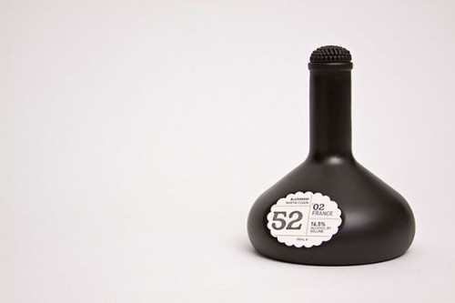
The client wanted the product to convey the nature of the ingredients, namely a blackberry liqueur. The bottle is a deep blue-black and is rounded to mimic the shape of blackberries. The top was created to feel like an actual blackberry. Instead of using a heavy ink in the letterpress, the label made with a soft press to indicate the stain that remains on your fingertips. The label is also cut to reflect the rounded shape of blackberries.
Juror Notes
Love the cap being reminiscent of a berry.
Good liquor (and liqueur) bottles are hard to pull off. What sounds like a good idea can rapidly become cheesy when it’s fabricated. In this case, the solution is simple and effortless, and the blackberry shapes on the stopper and label are a nice touch. Bonus! Easy to find the stopper in the dark!
Credits
- Design firm
- Jennifer Sterling Design
- Creative director
- Jennifer Sterling
- Art director
- Jennifer Sterling
- Designers
- Peter Pham, Jennifer Sterling
- Client
- 52, Inc.