An Object of Beauty
Grand Central Publishing, New York, New York, 2010
Description
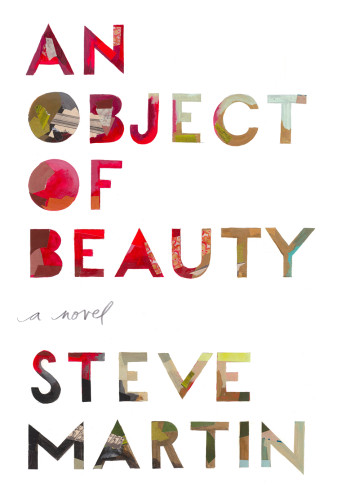
Project brief: An Object of Beauty is a novel about an ambitious young woman set in Manhattan’s high-powered art world during its heady days of the early 1990s until now. It is also a history of modern art. The stated challenge was getting a cover for a celebrity author done and approved in little over a month. The unsaid challenges were that the finished book needed to be as distinctive and beautiful as a piece of art itself.
Approach: With a strong title and beloved author, a text-driven solution seemed obvious. The author and I were both fans of Ed Ruscha’s textual flat paintings and most periods of modern painting. I spent an afternoon at MoMA looking at several other pop artists: Larry Rivers, Robert Indiana, Robert Rauschenberg and Jasper Johns, all of whom had incorporated painted text into their work. My objective was to create a cover that emulated text-driven art without being derivative of any one artist.
My first concept called for the cover lettering to be stencil die-cut, allowing for a painting on the bookcase to be revealed. However, production proved to be too complicated. Next was an attempt to make the title look like a painted canvas. I even thought of attempting to paint it myself. Thankfully, Darren Booth’s masterfully illustrated type had been on my radar. I hired him to do sketches and was thrilled with what I saw so he went to final quickly.
I envisioned a cover stock that emulated canvas. Much research was done to find a stock that looked like primed or unprimed canvas. Testing was done, particularly for the binding process, as this plastic stock, typically used on bookcases, had never been used as a book jacket before. Finally, Darren’s painted lettering was hit with an ultra-high-gloss lamination that emulated an oil painting’s linseed oil. For the end papers, the only direction I gave Darren was to paint something inspired by abstract expressionism or color-field painting.
The interior of the book called for four-color prints throughout. These prints follow the narrative as opposed to being relegated to a central four-color signature.
Effectiveness: Steve Martin, publisher, editor and agent were thrilled with the final book and cover. The book was well publicized and went on to be a New York Times best seller, hitting every national best-seller list.
Juror Notes
With the beautifully rendered spot gloss and the canvas-like cover stock, this jacket is a perfect match for a novel about the art world.
Credits
- Design firm
- Grand Central Publishing
- Creative director
- Anne Twomey
- Art director
- Anne Twomey
- Illustrator
- Darren Booth